How We Improve edTech Usability for Teachers Year-Round

Teachers are notoriously busy, which means perfecting product usability should be a UX priority.
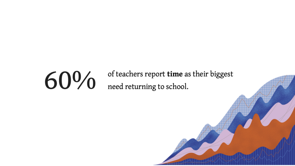
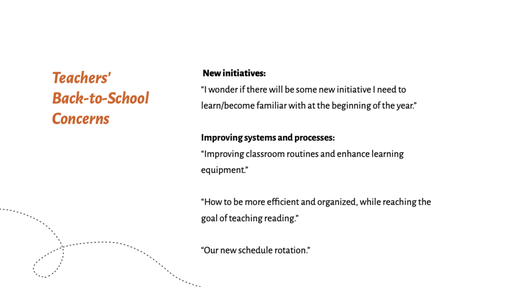
In our recent survey, 60% of teachers mentioned lack of time as one of their biggest concerns—especially during back-to-school season.
Any feature that slows educators down or causes them to duplicate work makes it even harder to adopt your product.
In this article, I’ll share design tips based on our user research report, How to Give Your Users Better Tools For Back to School.
From onboarding flows to integrations, focusing on ease-of-use will help you reduce administrative tasks for time-strapped educators.
Follow our tips to help teachers jump right into your learning tool without getting overwhelmed or frustrated.
Here’s how.
Improve product usability for teachers through easy onboarding
As teachers return to school, they spend more time preparing their physical classrooms than learning the ins and outs of a new edTech product or feature.
That’s why you should prioritize simple onboarding flows for your teacher persona—especially if your edTech product launches for back-to-school.
Here are four onboarding tactics that can improve product usability for busy educators.
1. Let them skip the tour
We get it. Sometimes products are complicated and a tour of features isn’t just warranted—it’s critical for use and engagement.
Still, give users the choice to skip the tour and come back later.
In all likelihood, teachers simply won’t have time to complete a full product tour when they first log on.
Forcing a busy user to complete an onboarding task can also backfire. You risk increasing their frustration, which makes them less likely to use your tool.
2. Help them jump right into a user flow
Forget training videos, lengthy product tours, and multi-step set-up prompts. Teachers need to log in and jump right into their work.
Let users choose which type of tutorial will help them best at the moment, or whether they’d like a tutorial overview at all.
Simple one-step prompts, like “Do you want to learn more about rostering?” can be a life-saver.
Remember: the easier you make it for teachers to jump right into a user flow, the more likely they are to come back to your product and learn all the ins and outs later.
3. Show just the highlights, please
Since educators are short on time, help them find the three to four features key to using your product successfully.
For example, you might:
- Highlight your rostering tool
- Provide a shortcut to the gradebook
- Or break down their most recent student assessment results
You can also add point-of-use reminders, so your learning tool always supports their next need.
4. Streamline student log-ins
Helping students get situated in an edTech product can take up a huge amount of classroom time.
Make it easier for teachers by:
- Using QR codes for student logins
- Adopting password variations by grade band to make logins more accessible, inclusive, and age-appropriate
- Using a single sign-on integration for your entire suite of products
Making the student log-in process easy sets an entire classroom up for success.
Plus, you’ll help teachers get back more time back in their day.
How integrations increase product adoption, eliminate user frustration, & save your budget
Throughout my time leading user experience research and testing efforts at Backpack, I’ve seen so many edTech companies churn through their budgets by trying to recreate popular products.
Don’t try to compete with Google Classroom, OneRoster, or other major platforms. Instead, research the tools your users rely on and “play nice” with their favorites.
For best results, we recommend embracing OneRoster compliance and devoting budget to email & gradebook integrations.
1. Embrace OneRoster compliance
OneRoster is a standardized way to structure rostering data.
This ensures compatibility between your learning tool and the other tools in a school district’s system, making it easier for teachers to manage changes to student data.
Meeting this need is a great investment of your UX budget, since it allows teachers to:
- Auto populate forms
- Sync student data across classrooms
- Minimize manual editing
2. Devote budget to email & gradebook integrations
If you’re already OneRoster compliant, the next areas to focus your budget are on email and gradebook integrations for ease-of-use.
Take Operoo, for example.
This tool helps schools manage important student data found on “blue cards,” or the emergency contact cards that contain guardian contact information and student allergies.
Unfortunately, Operoo doesn’t have email integration. That means teachers must copy and paste guardian information, then open an email application to reach family members.
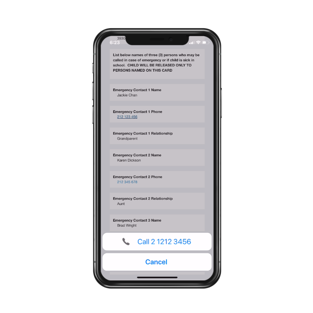
A simple upgrade would make the tool even more helpful for the teacher who use it every day.
Schoology, on the other hand, offers teachers an all-in-one tool for managing their rosters, gradebooks, and learning content.
Because the data within the tool regularly syncs for the entire school system, anyone who needs key information can retrieve it at any time.
That’s the power of a great integration!
Engage educators with bite-sized professional learning opportunities
Even though professional learning is important, it’s usually the last thing teachers have time for.
Making sure your team understands time as a user constraint, they can organize professional learning content in more effective ways. This includes:
- Short videos optimized for mobile, so teachers can watch videos on their phones
- Point-of-use calls to action for professional learning opportunities
- Collections of content that can help teachers meet immediate goals
While teachers don’t necessarily have time to seek professional learning content out, they still like, use, and need it.
Educators are more likely to use your learning content if you put it within reach—in a format that works best for them.
Conclusion
Prioritizing ease-of-use in teacher-facing products reduces friction, improves engagement, and ensures adoption.
Make the educator experience for your edTech products even stronger with design tips backed by evidence.
Download our most recent user research report—and get actionable design recommendations based on the research!

Monica Sherwood
Prior to entering the UX field, Monica was a special educator at public schools in Brooklyn and Manhattan. Her experience as a teacher has allowed her to develop a deep appreciation for research, and the ability to empathize with the unique needs of every user. She is also a strong advocate for inclusion and accessibility in design.
Monica obtained her undergraduate degree at NYU’s School of Individualized Study, and her Masters in Special Education at Hunter College. In her free time, she enjoys traveling, painting, and reading.